Thinking like a Filmmaker in Animation
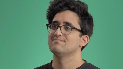
Before transitioning into animation and design, Jr. Animator and Designer, Tyler Rispoli started as a film student at the Savannah College of Art and Design. Here are 5 technical aspects of filmmaking that deeply inform his intentional approach to animation.
Beginning in middle school, I became obsessed with understanding the techniques filmmakers use when creating their work, specifically cinematography and editing. I spent years reading books, watching videos to learn techniques, and practicing them in my own films. I decided to attend SCAD and study film and television, but about a year into the program, I switched to motion design after meeting a few classmates who were studying animation. Motion design combined so many things I was interested in: design, film, animation, visual effects, and more, all under one umbrella, and that excited me.
Years later, my foundation in film continues to influence my work in motion design at Trollbäck and is always creatively rewarding. Every day feels different from the last and I work on a variety of challenges in animation that require different skills, plus I get to collaborate with an amazing team. I love that I’m still able to utilize my film background in various ways.
“Film school provided a strong foundation of motion techniques that aided my progression in design and animation.”
—Tyler Rispoli
The Match Cut
The “match cut” allows for continuity in an edit by matching action between two different scenes or shots. This foundational editing technique plays an important role in animation. Often animation is about tricking the eye and hiding a transition. Almost every day I find myself using a match cut when animating—it’s elegant and easy. Sometimes it’s important not to overthink how you’ll get from one element to another in animation.
Medium and Technique Drives Creative
I think of the medium as the form and style that make up a film, versus the materials you would choose, as in traditional visual art. While each art form has its own domain of expression and exploration, a film relies on so many choices of technique to tell a unique story and express meaning.
One common technical decision when starting a film project is whether it will be shot digitally or on film. I read about Marcell Rév, HBO Euphoria’s Cinematographer, who became obsessed with shooting Euphoria’s 2nd season on film. Rév shot the first season in large format digital but believed that, as the story progressed, shooting on film would better suit the nature of the characters. Furthermore, Rév wanted to shoot on a film stock called Kodak Ektachrome which was discontinued in 2013. Rév worked directly with Kodak to reproduce 35mm Ektachrome because he wanted its narrow dynamic range to create sharp contrast in scenes. Ektachrome is a high-grain and hyper-real color film that creates a lot of dynamic texture. This helped Rév capture the visual narrative that was right for the story. Understanding the technical aspects of the medium enables you to create a stronger narrative.
Just as filmmakers use different mediums and techniques for crafting their stories, we as animators have so many techniques available to us. I can choose to use tactile design, in-camera visual effects, optical scanning, 3D/2D animation, or frame-by-frame animation, to name a few. Each technique uses a different medium to drive the creative. Our work above with FOX is a great example of how different mediums can be combined with techniques to express something unexpected and impactful. It’s a great use of blending different animation and film techniques to shape the creative.
Focal Length Matters
Focal length really changes how you perceive an image in a film. The most powerful example that I like to use is a dolly zoom, which (uncredited) cameraman Irmin Roberts used in Alfred Hitchcock's Vertigo in 1958. By moving the camera and adjusting the focal length simultaneously, he literally creates the illusion of vertigo.
Throughout a film, every focal length that is chosen by the cinematographer has an intention. In 3D animation, it’s equally important. If I set up a scene with a very wide focal length like 18mm, all of the proportions feel distorted, which may be problematic. But a wide focal length can also make a scene feel like it’s moving faster when the camera is moving. A narrower lens, like a 100mm, will compress the foreground and background objects to bring them into the same space. Slowly changing from one to the other while moving the camera creates that famous Vertigo effect. Watching Disney Pixar’s Ratatouille I spotted this instantly. Objects in the scene are stationary but appear to be moving because of the camera dolly and slow adjustment of focal length. Choosing the right focal length is how I can focus the viewer’s attention while creating the right emotion.
Shot Size Matters
Composition and framing are the last choices I’ll cover here. Similar to composing a film shot, I use the shot size to draw the viewer’s eye to a certain part of an animation. Shot size also helps me determine the scale of the various elements on screen. When I crop in or cut closer on elements this has an intentional effect, while pulling out wider creates a different emotion. Varying shot sizes throughout an animation allows for much greater visual interest. I may also change the shot size within a sequence via a cut or match cut to heighten the emotion. Sometimes I make these choices intuitively, but often we need to create guidelines that can be used by other designers and animators to be consistent every single time. Our work for Disney+ showcases how a flexible design system can allow for various shot sizes to be used throughout animation and design.
Color Evokes Mood
Color defines the tone of a film because it makes us feel a certain way. Once the look is decided upon, consistency of color is always a priority in every detail of a shoot (lighting, sets, costumes) all the way through to how scenes are graded in post-production. Similarly, we talk a lot about our choices in the design process and how it feels in animation. We know that physiologically and psychologically, color combinations stimulate areas of the brain in ways to surface feelings of excitement, serenity, or anxiety. With each project, we work hard to choose the right combination of colors to create a specific emotional response.
Knowing how color invokes mood in film, I never ignore color in animation. Our work with director Little Marvin on the THEM: Covenant title sequence is a powerful use of the color red. Motivated directly by the show’s focus on racial discrimination through the process of redlining, the color also helps establish the unsettling nature of the narrative. It also works well with our mixed-media animation approach, which uses jagged red lines to overtake the screen and create an unsettling tone. I think this is a prime example of how color can make or break a piece by pushing the mood.
Explore more
New business inquiries.
How can we help?
NYC 09:50
STK 03:50
LA 06:50
Get our newsletter
Sign up for updates,
insights, and inspirations
from our studio.


