
Finding Motion Graphics Inspiration in Gaming
Senior Animator Marcelo Meneses writes about the sometimes-overlooked world of video games when it comes to finding inspiration for motion graphics.
Motion graphics are present in many areas of entertainment. As motion design artists working in branding and advertising, we find inspiration throughout the web, film, tv, and everyday life. A less conventional source is video games, but they are full of artistic expression, and motion plays a huge role.
Motion graphics in video games range from title sequences that immerse players in the game at the start to pre-rendered cutscenes that tell a story, to toolkits and packages for a game’s competitive community (many multiplayer video games have established teams around the world, much like actual sports leagues). There are so many video games out there filled with all kinds of design and animation, making them a valuable source of inspiration.
Ghost of Tsushima: Ink Animations
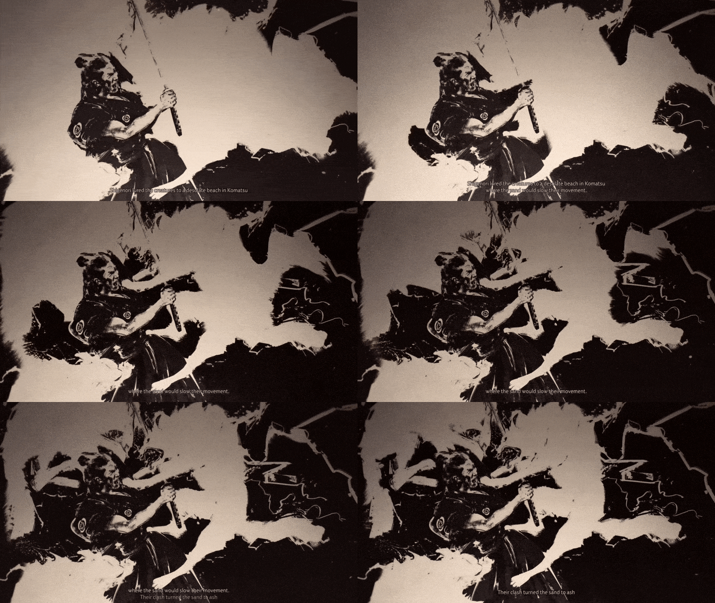
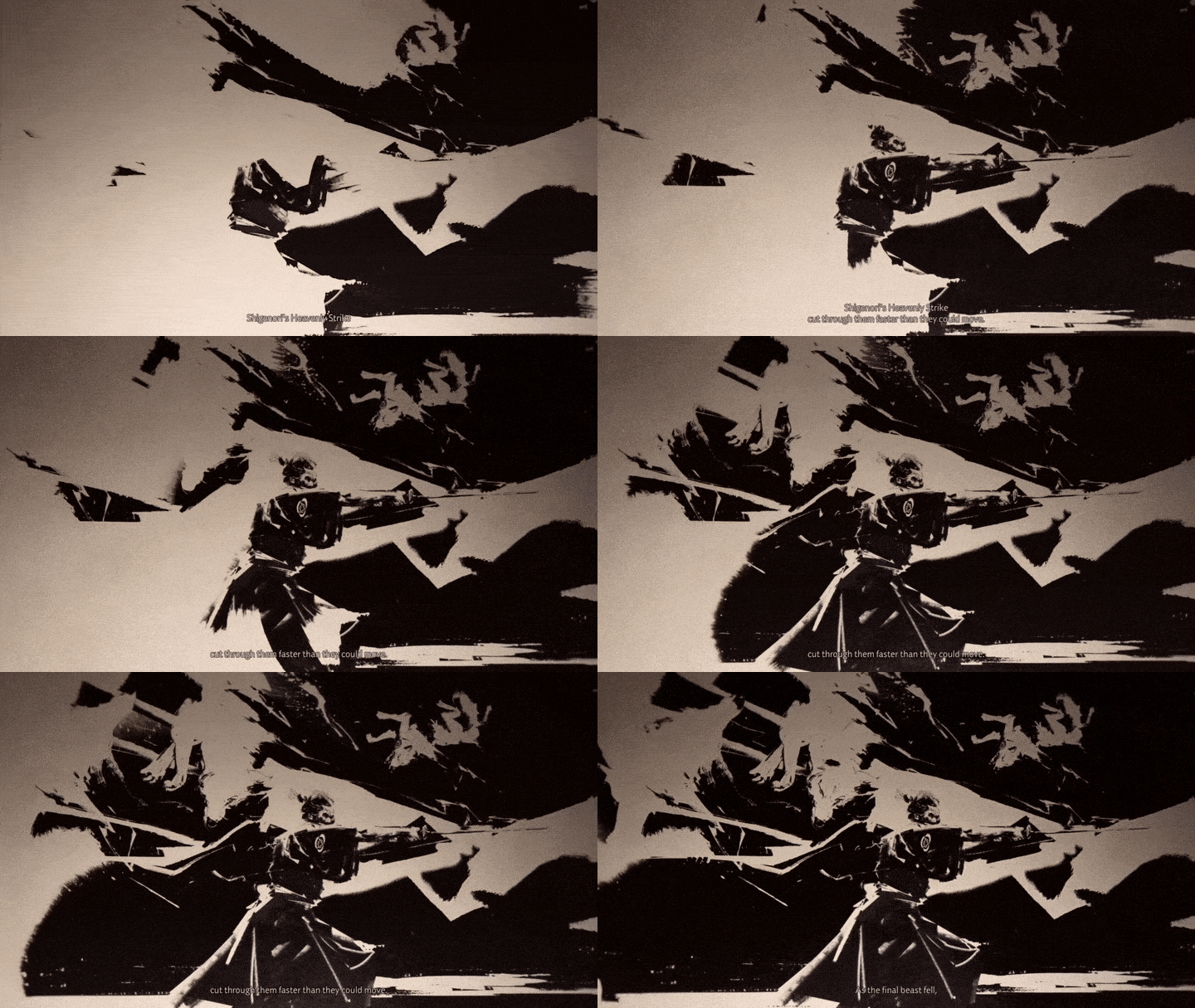
Ghost of Tsushima is a 2020 action-adventure game developed by Sucker Punch Productions and published by Sony Interactive Entertainment. Featuring an open world, the player controls Jin Sakai, a samurai on a quest to protect Tsushima Island during the first Mongol invasion of Japan. As you traverse the open world of Ghost of Tsushima, you’ll encounter a musician named Yamato that will tell you stories called Mythic tales that will help you find items or abilities that can drastically change the way you play.
These tales have their own pre-rendered cutscenes with bold, expressive ink illustrations that are very skillfully animated using an ink reveal style. I have seen countless ink reveal tutorials and have even made some myself, but there’s something so controlled and intentional behind the way Sucker Punch does it. The ink flows from page to page, never erasing the art behind it, and the sound effects are beautiful and evocative. These expertly-crafted ink animations with great pacing, seamless transitions, and unique reveals are a great source of inspiration for well-executed, purposeful masked reveals.
Valorant: Toolkit/Branding
One of the most well-branded video games out there, in terms of both marketing and their esports scene, is Valorant: a tactical shooting game involving two teams with five players on each team. Worship is the motion animation studio behind Valorant. They’ve created editable toolkits that were sent to regional teams around the world and featured 17 languages.
They also created a comprehensive toolkit that allows other parties, such as broadcasters, vendors, streamers, and design studios to easily understand the brand and create content for the Valorant Champions Tour (VCT). These motion toolkits are very similar to the ones we produce at Trollbäck for our clients, allowing many different teams to follow the same motion guidelines consistently.
Throughout the Valorant Champions Tour, there are four stages in which teams from all over the world compete: First Strike, Challengers, Masters, and Champions. Each of these stages follows a similar design structure when it comes to the package but with different key assets, graphic language, and color palettes.
With a sleek, modern, and dynamic package that adapts throughout all the tournament stages, Valorant made an explosive entry into the esports scene. As an avid Valorant player, I am constantly inspired by the consistency of the package design and animation whenever I watch my favorite teams compete.
What I really like about the Valorant package design is how dynamic it is. It is a fast-paced, editorial motion language that is full of energy and excitement, which is in line with their brand overall. One of my favorite elements of the package is the uniquely animated typography. Even the sponsor logos are animated in the same motion language as the package itself.


Deathloop: Narrative Cutscenes
Deathloop, developed by Arkane, is an assassination game with a rich narrative developed through the use of cutscenes. Players experience the main story as Colt, a man trapped in an endless loop who must hunt down targets in order to earn his freedom.
Throughout the game, you are introduced to villains, characters, and backstories through dynamic, illustrative, retro animations. With a Saul Bass-esque style, these cutscenes enrich the storytelling and immerse the player into a spy-thriller story of rivalry and deceit. Instead of in-game dialogue or pages of information to read through – common means of introducing storylines to new players – the cutscenes tell the stories in a vibrant way that’s fun to sit through and make the exposition more interesting and artistic.
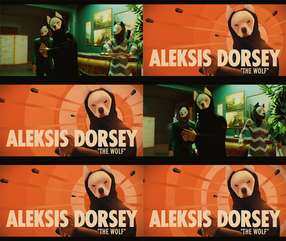

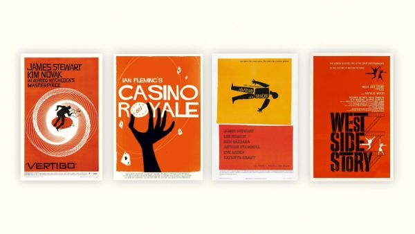
The art direction for Deathloop’s cutscenes reminds me of some of Saul Bass’ film posters and title sequences. There are also similarities between Deathloop cutscenes and Olivier Kuntzel and Florence Deygas’ title sequence for “Catch Me If You Can.” The 2D-animated flat illustrations, in combination with a restricted color palette, lower frame rate, and sharp, jagged edges, are reminiscent of these other works of art referenced above.
Far Cry 6: Title Sequence
Far Cry 6 is an action-adventure game that immerses players into a modern-day guerrilla revolution. Antibody created a fantastic title sequence for the game that touches on many themes from the game in a beautiful and inspiring way, reminiscent of television main titles.
The sequence takes us through a journey of seamlessly blended transitions and game iconography – a car doing donuts, Petri dishes, red smoke on agricultural crops, graffiti on rusty war tanks. Creative Head of Production Patrick Clair and his team at Antibody wanted to evoke a time of conquistadores and dictatorships, where cars burn rubber in the streets and scientific progress is corrupted by those in power. This piece is a great example of what makes a title sequence successful by setting the mood before the game begins with hints of the world within.


Gris: 2D Animation
Gris is a 2D platform adventure game by Spanish developer Nomada Studio. Gris is a hopeful young girl lost in her own world, dealing with a painful experience in her life. Gris is a game free of danger and frustration. Players explore a beautiful world that is filled with delicate art and intricate animations. Light puzzles and platforming reveal themselves the further along you get into Gris’ world.
Interestingly, Gris’ development team mostly consisted of artists who had never worked on video games before. This makes the game feel unique in the landscape of video games. The development team also included Conrad Roset, a famous illustrator based in Spain. He drove much of the creative side of development, and his influence is clear in the motion graphics.
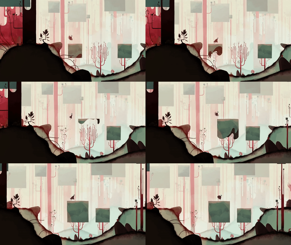
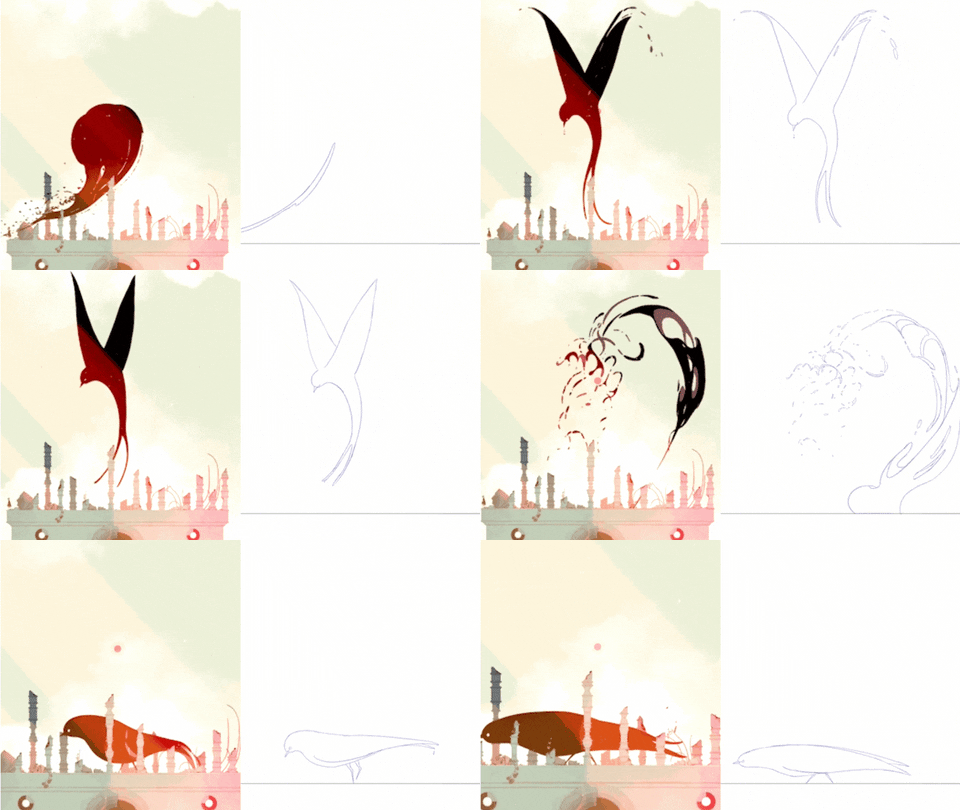
In the world of Gris, there are color palettes and scanned watercolors that inform the environment. As you progress throughout the game, the colors start changing and are meant to convey the progressive experience of grief that the character goes through. Gris uses many cel animated (frame-by-frame) looping animations, from trees animating in and out to serve as jumping puzzles, to birds flapping their wings in the background. All of this combined makes the game feel a lot more tactile and as if it was done on paper.
Unexplored Worlds
There are countless more video games out there with astonishing motion graphics to reference for a wide variety of design ideas and concepts for storytelling – whether it be 2D, 3D, title sequences, transitions, toolkits, or brand packages. Next time you’re in need of some inspiration, why not dive into a new world and check out a game?
Explore more
New business inquiries.
How can we help?
NYC 11:05
STK 05:05
LA 08:05
Get our newsletter
Sign up for updates,
insights, and inspirations
from our studio.


