transparent layer
Tröllback+Company Logo

THEM: Covenant

Them: Covenant Title Sequence

Context

Create a title sequence and branding for Them: Covenant, an Amazon Studios thriller series on redlining, racism, and supernatural violence in 1950’s Compton.

Strategy

Immerse viewers in the history, oppression, and malevolent forces featured in the show with a striking, in-camera approach blending real and imagined, past and present.

Solution

Every element we created takes audiences back to an all-too-familiar era of fear and injustice, setting up the complex emotional and narrative premise of the found footage story.
Creative Context

From 1952-1959, Compton’s non-white population grew from 11% to 37%. What followed was a real story of fear and division that continues to impact Los Angeles to this day.

Them: Covenant is the first season in an upcoming thriller anthology created by writer and producer Little Marvin. Centered around a Black family moving from North Carolina to the all-white neighborhood of East Compton in the 1950s, it’s a story where malevolent forces both real and supernatural threaten to taunt, ravage, and destroy them.

Starring Deborah Ayorinde, Ashley Thomas, Shahedi Wright Joseph, Alison Pill, and Melody Hurd, Them: Covenant is a terrifying, provocative, and profoundly relevant dramatization of the real and imagined horrors of redlining, segregation, and racism in America.

Title Sequence

Our titles for Them: Covenant, shot in-camera, then edited and animated in-house is an ode to vintage horror, mixed media, and Faustian thrillers popular during the time.

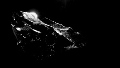
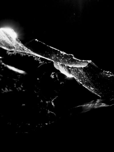
Inspired by iconic Saul Bass titles for films like Vertigo, Cape Fear, and Lady in a Cage, we shot much of the sequence in-camera, experimenting with techniques like stop-frame animation, paper play, shadow work, and film degradation to create a graphic, jarring introduction using red lines as a thematic through-line that foreshadows the narrative.

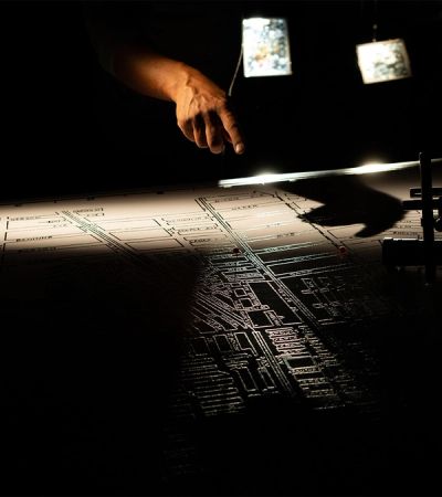
In-camera shots were then edited and animated in-house, using a staccato style and low frame rate to achieve the same analog quality. The result is a half tactile, half digital world where composited red lines, shapes, and redactions drive real-world divisions across live-captured maps, photographs, and documents — illustrating to audiences how racial discrimination in housing and community policing shaped the demographic and wealth patterns of American cities, while hinting at the oppression, surveillance, and violence to come.

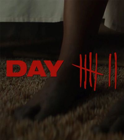
THEM Covenant Day Count

Graphic Identity

Additional branding elements further immerse viewers into the setting and headspace of Marvin’s uncanny horror anthology.

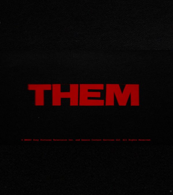
From the outset, retro Sony Pictures and Amazon Studios vanity cards take audiences back to the 1970s, the time period in which Them: Covenant’s shocking footage was supposedly “found.” After the title sequence, a minimal opening crawl inspired by 70s horror titles sets up the history, protagonists, and premise for the series.

As we descend into the story, jagged red lines mark out the horror that unfolds, day-by-day to the Emory family. Finally, retro-style end credits close out each episode with a nod back to the history and sociopolitical forces introduced in the opening titles.

THEM Covenant BTS Map
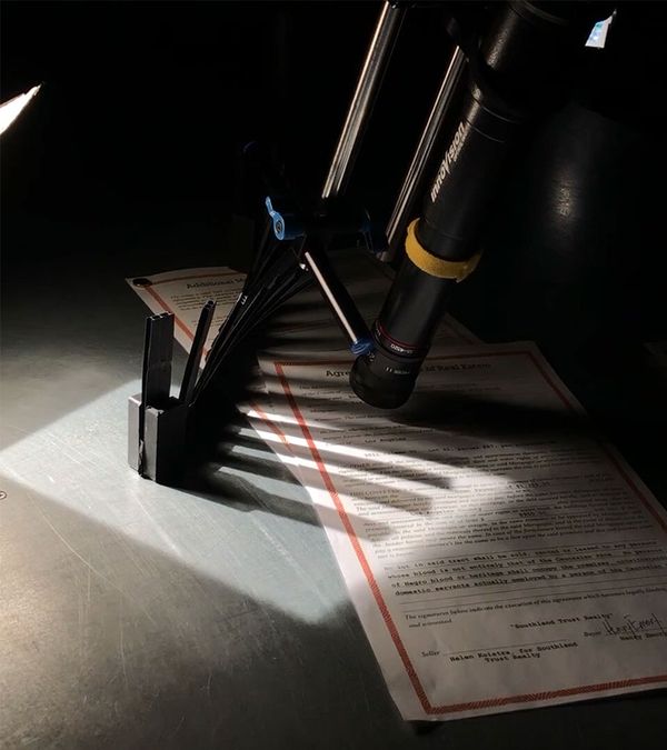
THEM Covenant BTS Cameras
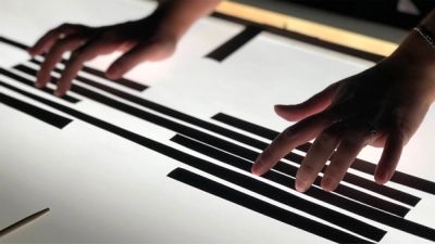
THEM Covenant BTS Hands

BTS

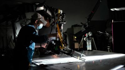
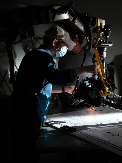
Behind the camera, our crew of directors, designers, animators, and VFX artists created an entire visual world of history and fear.

Created in collaboration with Chris Webb at Brooklyn’s FX WRX studio, our titles for Them: Covenant sought to combine the best in title design with the best of in-camera effects. Created in the midst of the global pandemic, nationwide protests, and government oppression, it felt distinctly appropriate to go all-in on creating something real and visceral for the series.

Archival family photographs, handwriting, contracts, and other elements distressed by hand, were then arranged at various depths on a wire rig, moving our camera and light sources across the room to reveal them at different levels. We then joined these scenes with digital animations, remixing dozens of unused shots and in-camera experiments with moving red lines and fragmented glimpses of horror and history featured in the BTS film.

As a final nod to Saul Bass, we end the sequence by breaking the fourth wall with our audience, revealing the show logo from red cut-outs in stop-frame animation — wiped away by a very real, unseen, sinister hand.

Services

Title Design –– Live Action –– In-Camera VFX –– Fabrication –– Graphic Design –– Animation –– Production –– Editing –– Post-Production

New business inquiries.

How can we help?

NYC 09:50

STK 03:50

LA 06:50

New York

88 Pine St, 18th Floor
NY, NY 10005

+1 212 529 1010

Stockholm

Fridhemsgatan 53
112 46 Stockholm

+46 733 889 915

Get our newsletter

Sign up for updates,

insights, and inspirations

from our studio.

2024 © Trollbäck+Company