transparent layer
Tröllback+Company Logo

Sesame Street

Context

Create a safe space for children to learn, feel, grow, and explore by creating a fresh, expansive motion identity that honors the brand’s legacy and moves it into the future.

Strategy

Establish a motion language that captures the tactile, sensory experiences of Sesame Street and transports audiences into a world filled with beloved characters.

Solution

A global motion identity and flexible visual system that can amplify either the Sesame Street brand or its content by easily adapting to different creative contexts.
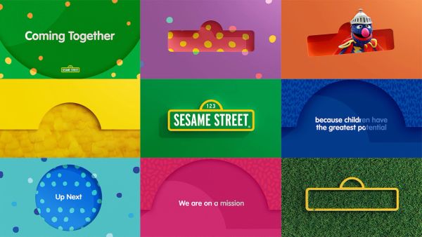
Grid with 9 different frames of the Sesame Street brand
Poster design with pink fur poking out of a cutout shape and the Sesame Street logo on the bottom.
Three Instagram swipe post designs with the phrase "See us coming together."

Design Language

We created a tactile, character-driven graphic framework that brings the muppets to life.

Working closely with the internal teams at Sesame, we identified and leaned into one of the most salient qualities of Sesame Street—that it feels like a real place, full of trusted friends: a safe space for children to learn, feel, grow, and explore.

We identified the most recognizable elements for each muppet—Elmo, Cookie Monster, Big Bird, and others—and designed a system of patterns in both 2D and 3D based on their most recognizable features and qualities. These patterns live within the framework of the iconic street sign, with a dimensional quality that beckons the viewer inside.

End card for Mecha Builders on Sesame Street
Patterned toptag that reads "Coming Up Next."

Motion Theory

We leveraged the street sign and created a series of “micro-worlds” for the audience to step inside.

The motion language we established for the brand captures the feeling of being in the moment. Motion behaviors include long camera moves that transport viewers in and out of the Sesame Street experience, along with quick cuts that create the sensation of being carried from one place to another. Our type animation bounces playfully in, expressing the joy children feel when they interact with Sesame Street.

We scaled the brand’s existing visual identity and articulated the emotive principles of Visceral, Joyful, Playful, and Bold, which guided our process from concept through execution. Our new motion system introduces a useful “brand dial” to amplify different tonal ranges and enables flexibility with cohesion.

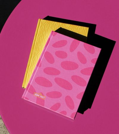
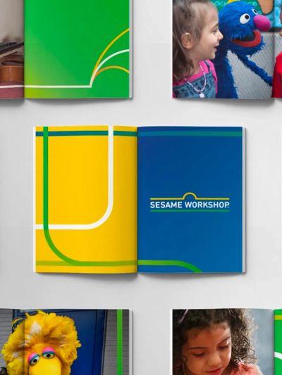
Two patterned book designs on a table
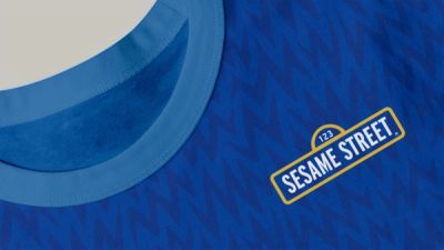
A fur-patterned t-shirt with the Sesame Street logo
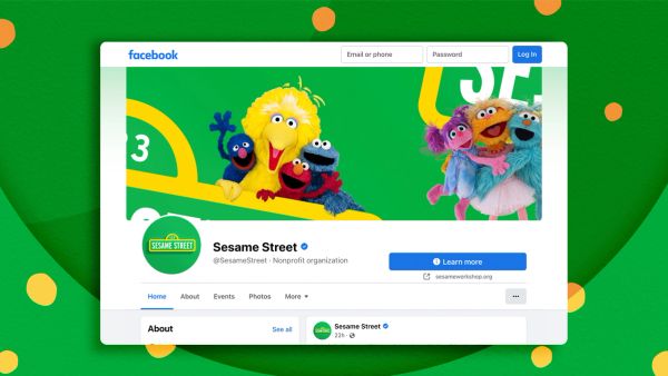
Facebook page design with patterned background
Sesame Street Instagram story design with a picture of Cookie Monster and words that read "Cookie Monster has an English cousin! His name is biscuit monster!"
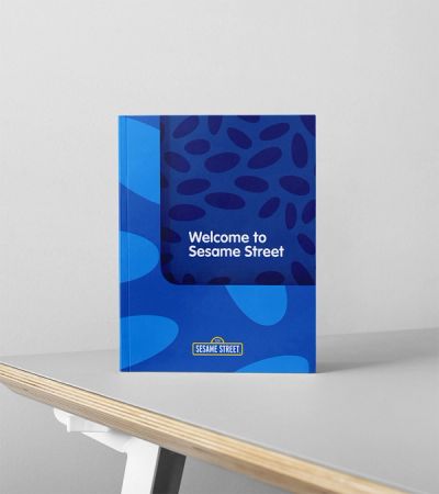
Sesame Street branded book with the words "Welcome to Sesame Street" written on the cover.
Two patterned tote bag designs

Brand Extensions

We built a toolkit of social and digital templates to help scale the identity and unify creative assets across the globe.

These tools offer internal teams guidelines to imagine new possibilities for extending the brand into the future, enabling Sesame Street to work seamlessly across teams and locations, and serving as inspiration for additional branding collateral, swag, and content.

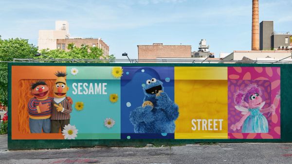
Wide, patterned billboard design reading "Sesame Street" with Bert, Ernie, Cookie Monster, and Abby Cadabby

Services

Brand Strategy –– Design Strategy –– Visual Identity –– Graphic Design –– Animation –– Toolkits –– Animation Toolkits –– Motion Guidelines –– Brand Guidelines

New business inquiries.

How can we help?

NYC 09:50

STK 03:50

LA 06:50

New York

88 Pine St, 18th Floor
NY, NY 10005

+1 212 529 1010

Stockholm

Fridhemsgatan 53
112 46 Stockholm

+46 733 889 915

Get our newsletter

Sign up for updates,

insights, and inspirations

from our studio.

2024 © Trollbäck+Company