transparent layer
Tröllback+Company Logo

MNN

Context

Re-energize Manhattan Neighborhood Network, NYC’s first and largest public access channel/community hub dedicated to free speech and media education.

Strategy

Rebuild the nonprofit’s identity, including new channel names, bolder messaging, and a dynamic system of multi-platform assets to help realize a new era for the “Unmediated” platform and its creators.

Solution

Fresh and unapologetic, the new brand identity allows for a more compelling and clear proposition for students, creators, and change-makers to organize, learn, and amplify their voices with MNN.

MNN

MNN Shows
MNN AOC

Creative Context

Re-introducing the only place on New York City television with no ads, no censors, and definitely no limits.

MNN is Manhattan’s public access channel and the country’s largest community media center. Since 1992, the nonprofit has been providing affordable education, equipment, facilities, programming, and air time to creators and organizers across the city—from Andy Warhol to BLM.

Through company interviews and watching hundreds of hours of public access TV, we learned there are only three rules while you’re on-air at MNN: No advertising. No penetration. And don’t incite a riot.

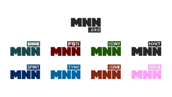
MNN Brand Architecture Logos
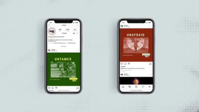
MNN Social
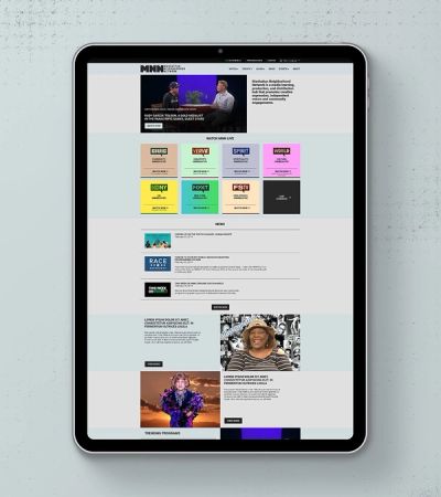
MNN Website
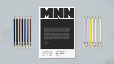
MNN Brand Collateral

Visual Identity System

Extending the brand’s aesthetic, with creators in mind.

We began by developing a fresh mission, voice, and channel names for the organization inspired by grassroots activism, old-school broadcast acronyms, and MNN’s diverse and unfiltered programming.

Inspired by indie zine culture, community flyering, and public access antics, the bold, unexpected visuals help add much-needed context to MNN’s programming, while also letting the content speak for itself. A new homepage design aligned the most-used part of the platform with its new channel identities. We also created producer toolkits to empower a more unified, seamless, and intuitive process for MNN creators to build their own show promos in the new brand voice and aesthetic.

Brand Campaign

For audiences, MNN is not like most media outlets. It’s “Unmediated” by design.

Our primary goal was to help raise awareness, appeal to a younger demographic, and generate interest around all of MNN’s certifications, courses, and facilities. MNN wanted a promo package designed to re-introduce people of all backgrounds to all the possibilities of public access, but we envisioned so much more.

We developed a modular tagline system around our core premise of “Media, Unmediated” that drives the idea home by defiantly describing MNN with all the things it’s not—inviting creators and communities to learn, grow, and produce media without boundaries. Then we spent countless hours watching MNN’s shows to build a series of ads that highlight exactly how special the network is.

NYXT

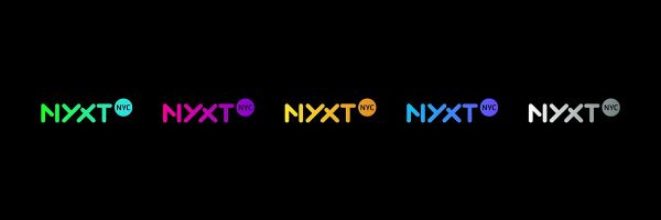
NYXT Logo Colorways

Naming + Logo Design

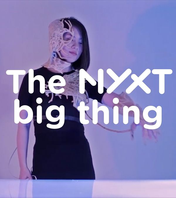
Years before rebranding Manhattan Neighborhood Network, we named and designed their newest all-access cable channel and digital platform.

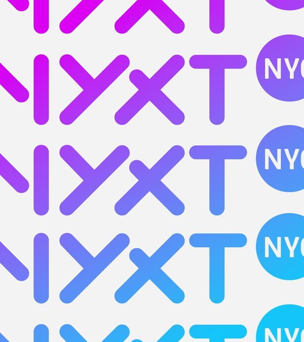
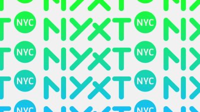
We began with a strategic naming and logo exploratory phase, ultimately selecting NYXT to represent the brand. NYXT reflects the channel’s mission to share “what’s next” with on-the-go new Yorkers. A modern typeface and color gradient celebrate the city’s diversity and range of community voices.

Information Architecture

A substantial component of NYXT’s design is its always-on navigation.

The navigation system features active sidebars and menus that communicate the programming slate and track segment duration. Supplemental information on events and content lives alongside the footage, inviting viewers to connect with partner organizations to learn more and engage in their communities.

The brand design also extends across platforms and devices. Apart from traditional cable broadcasting, all of NYXT’s content lives online and is available to livestream. Our brand strategy considered the network’s digital consumer needs, leading us to incorporate the domain extension to the name and logo, and design collateral that functions across future platforms.

NYXT X Icon
NYXT Icons

Branded Iconography

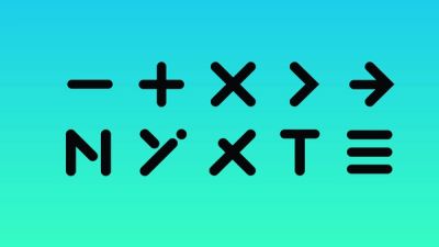
We also created a set of custom icons based on the NYXT logo letterforms.

A glyph system of Xs and arrows guide the viewer’s eye to the what, where, and when of upcoming events and programs. The designs were developed in tandem with the logotype and reflect NYXT’s progressive attitude.

Services

Brand Strategy –– Brand Architecture –– Naming –– Visual Identity –– Campaign Strategy –– Tagline –– Copywriting –– Logo Design –– Graphic Design –– Web Design –– Iconography –– Animation –– Editing –– Post-Production –– Brand Guidelines –– Toolkits

New business inquiries.

How can we help?

NYC 09:50

STK 03:50

LA 06:50

New York

88 Pine St, 18th Floor
NY, NY 10005

+1 212 529 1010

Stockholm

Fridhemsgatan 53
112 46 Stockholm

+46 733 889 915

Get our newsletter

Sign up for updates,

insights, and inspirations

from our studio.

2024 © Trollbäck+Company